
LOYALS “LOVE ME BAD” EP BRANDING CASE STUDY
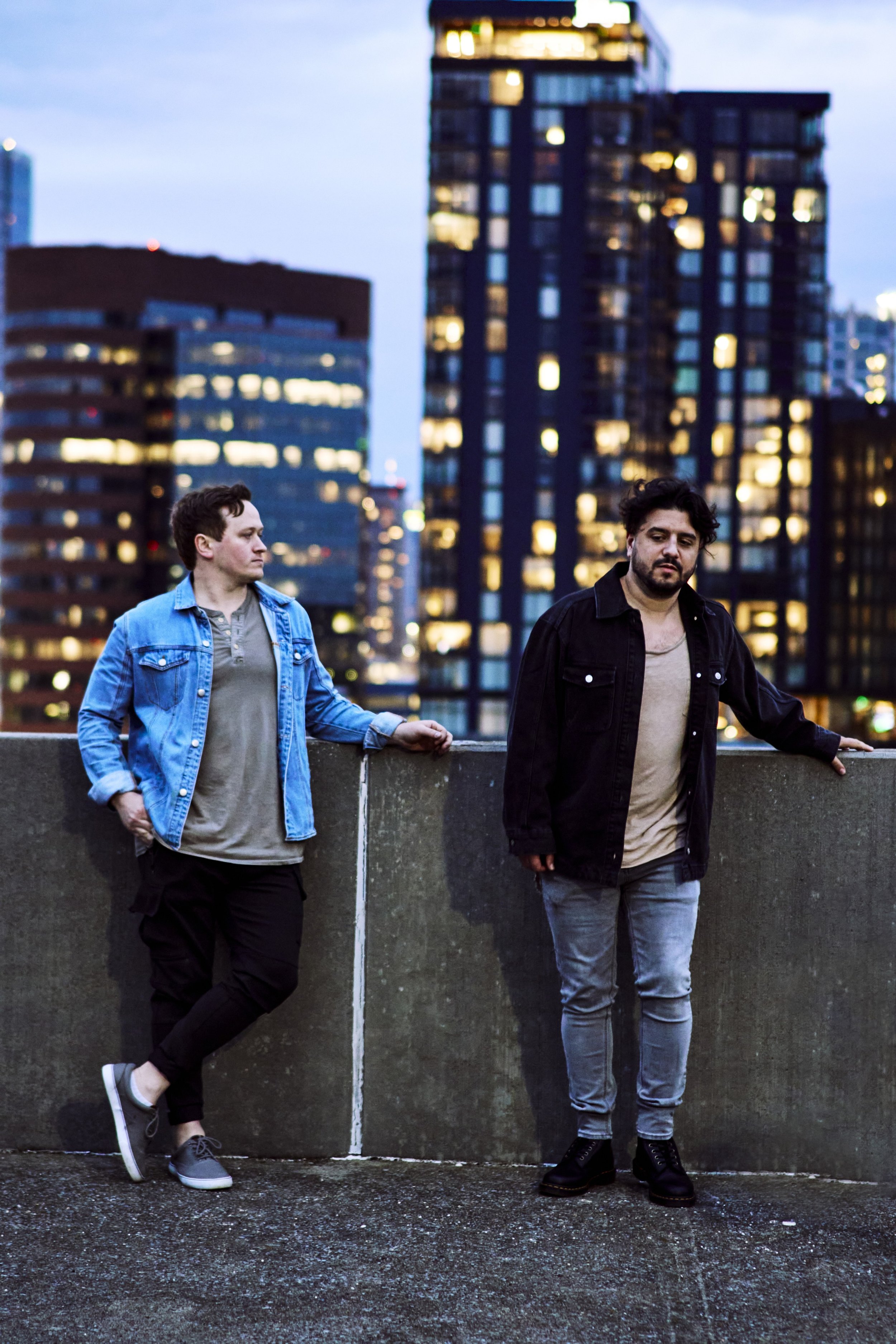
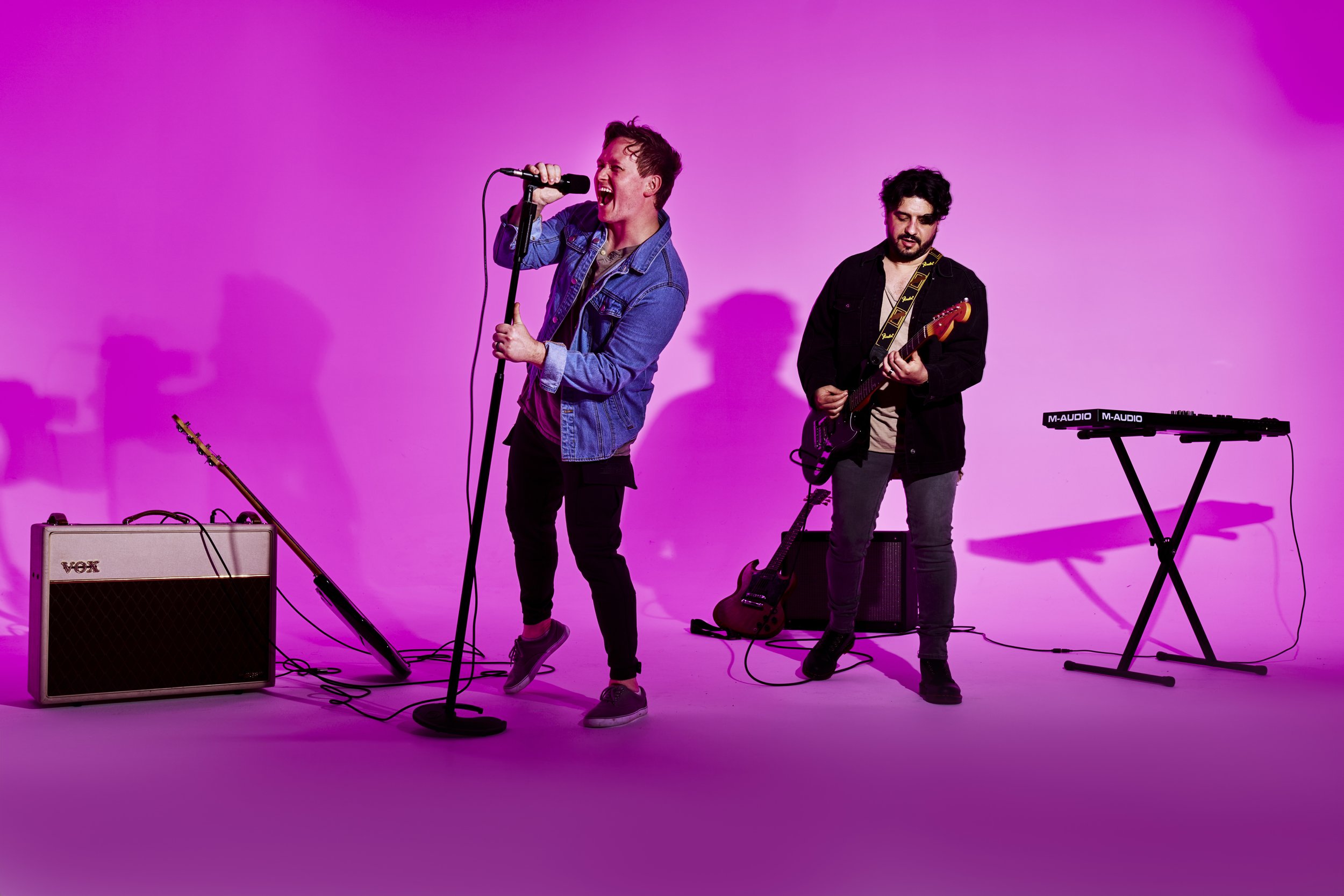
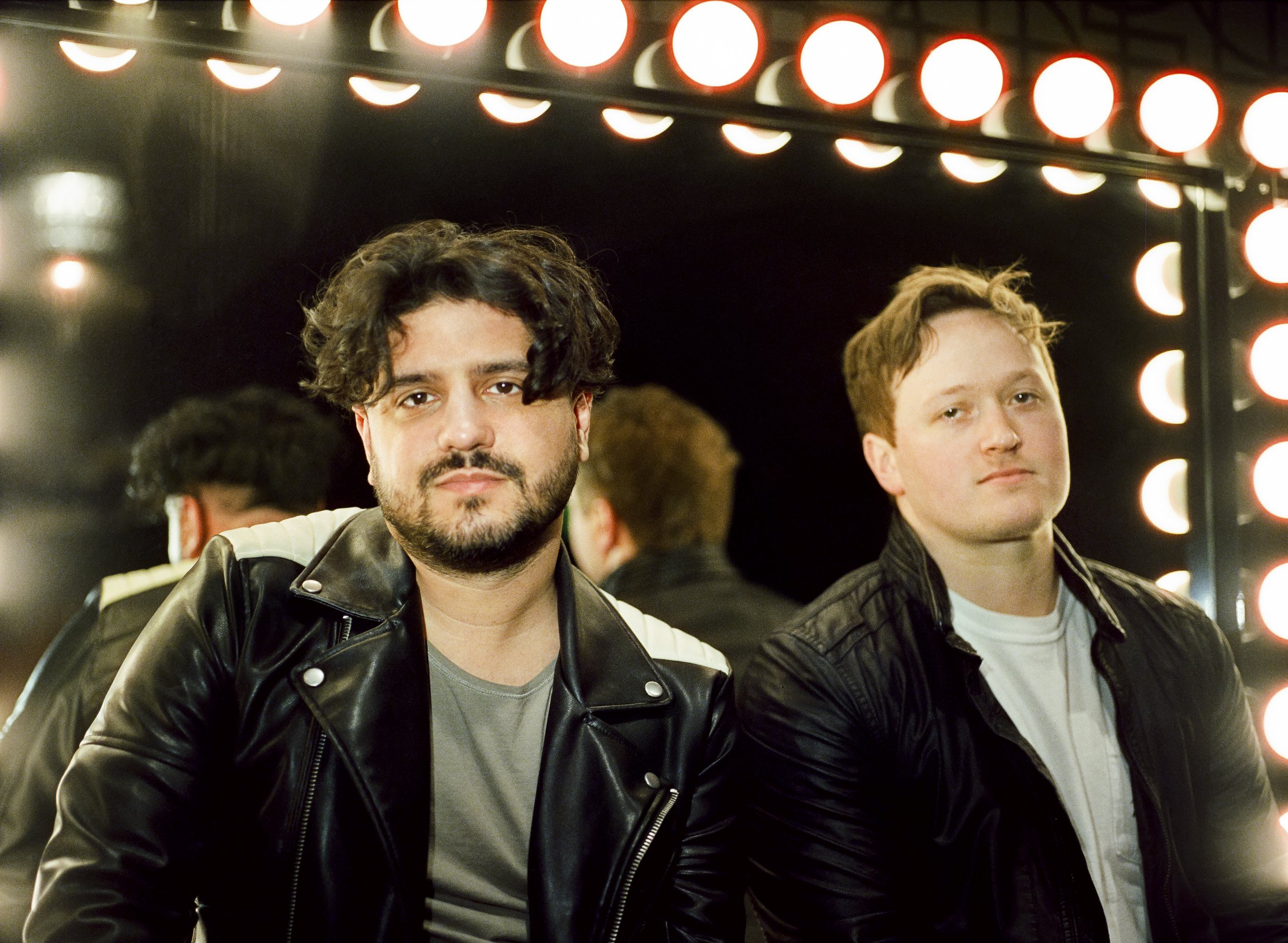
LOYALS came to suede + co. looking for a brand refresh. Updated logo, new photos for press & socials, designed cover arts for their EP LOVE ME BAD & social videos made to promote online. Ali Gomez reworked the logo & formed a pitch to put it all in perspective. Once approved, a media day was scheduled and executed to shoot all of the content for the rollout. Below is the team that made it all happen.
Creative Agency: suede + co.
Production Company: Corner Media Entertainment @cornermedia.ent
Creative Director: Ali Gomez @alirenae
Photographer: Brenton Giesey @bgiesey
Cinematography: Jason Hassell @thehassellfreedp
Producer, Lighting: Noah Cordell @noahcordell
Grip: Sheila Dunaway @_sheiladunaway
Assistant Camera: Paris Silver @silver.paris
BTS: Maggie Friedman @maggielndnphoto
Shot at Studio 615 @studio_615


The surreal single and EP cover arts were made in conjunction with each other using lots of negative space, minimal fonts, and saturated tones with striking visuals to accompany the story that the band was trying to tell with this EP: a one-sided saga of a relationship that was doomed from the start. The EP Cover Art (photo by Brenton Giesey, design by Ali Gomez) is the first time LOYALS has put their own face to their name. We went back and forth on whether or not they wanted their mugs on any of the covers and eventually landed on what you see for the LOVE ME BAD EP Cover. They felt it was important to show the two of them as a duo after everything they’ve endured as a band. Starting with a five-piece rock band playing at churches and conferences when they were teens to becoming a duo in 2018 has proved a lot of change. Having started their families, enduring all that life has had to throw at them, and honing their crafts on various side projects - Dane and Andrew wanted to make this project a little more personal by including some of their individual and vulnerable experiences into the lyrics of each song on the LOVE ME BAD EP.
“No Tomorrow”
“I can’t say no tonight, so I’ll just no tomorrow” to me, personally, is one of the best lines on the whole EP. The messy mental and emotional repercussions of breaking a boundary with someone you’re not in love with anymore set the scene for a moody night time sunset backdrop.


Photos by: Brenton Giesey
“SHE HATES ME”
“It never gets better but I’ll never be a better guy” lyric lent itself to the visual in the sense that this song is from the perspective of someone who has nearly given up on the relationship he’s in; everything is monochrome, there’s static on the tv, he feels numb - that is the feeling we wanted to evoke with this song’s visuals.


Photos by: Brenton Giesey
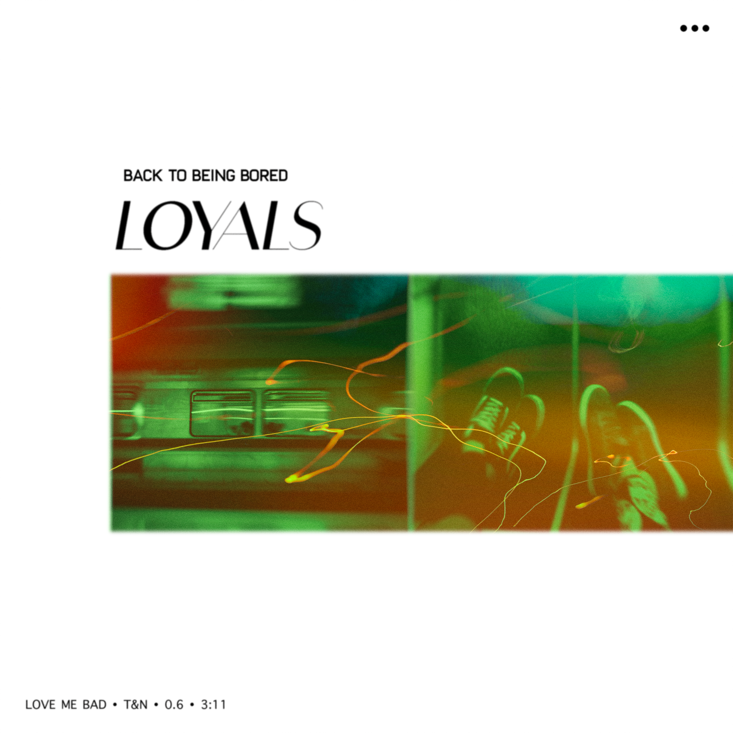
“BACK TO BEING BORED”
With the social video pieces, we wanted to have fun and carry the tones that were set by the single art over to the screen with colorful and fun setups that showed the band’s personality and showcased pieces of each song. “Back To Being Bored” social content was inspired by Blink-182’s “Always” music video.


Photos by Brenton Giesey
LOGO REFRESH
Andrew and Dane wanted to keep the spirit of the old logo, but less of that 2013 trendy/skinny typeface and something that was more uniform looking across the board. Something we all agreed on was that the three ellipses for the band’s emblem should stay. It pays homage to when the band was first formed and it was important to them to keep as part of the band’s brand.

“GIVE TO ME”
“Give To Me” visuals HAD to be vibey. The bass line told us so! Using a projector and visuals that were modulated to the song’s rhythm, we had fun shooting in this blue and orange wonderland.


Photos by Brenton Giesey
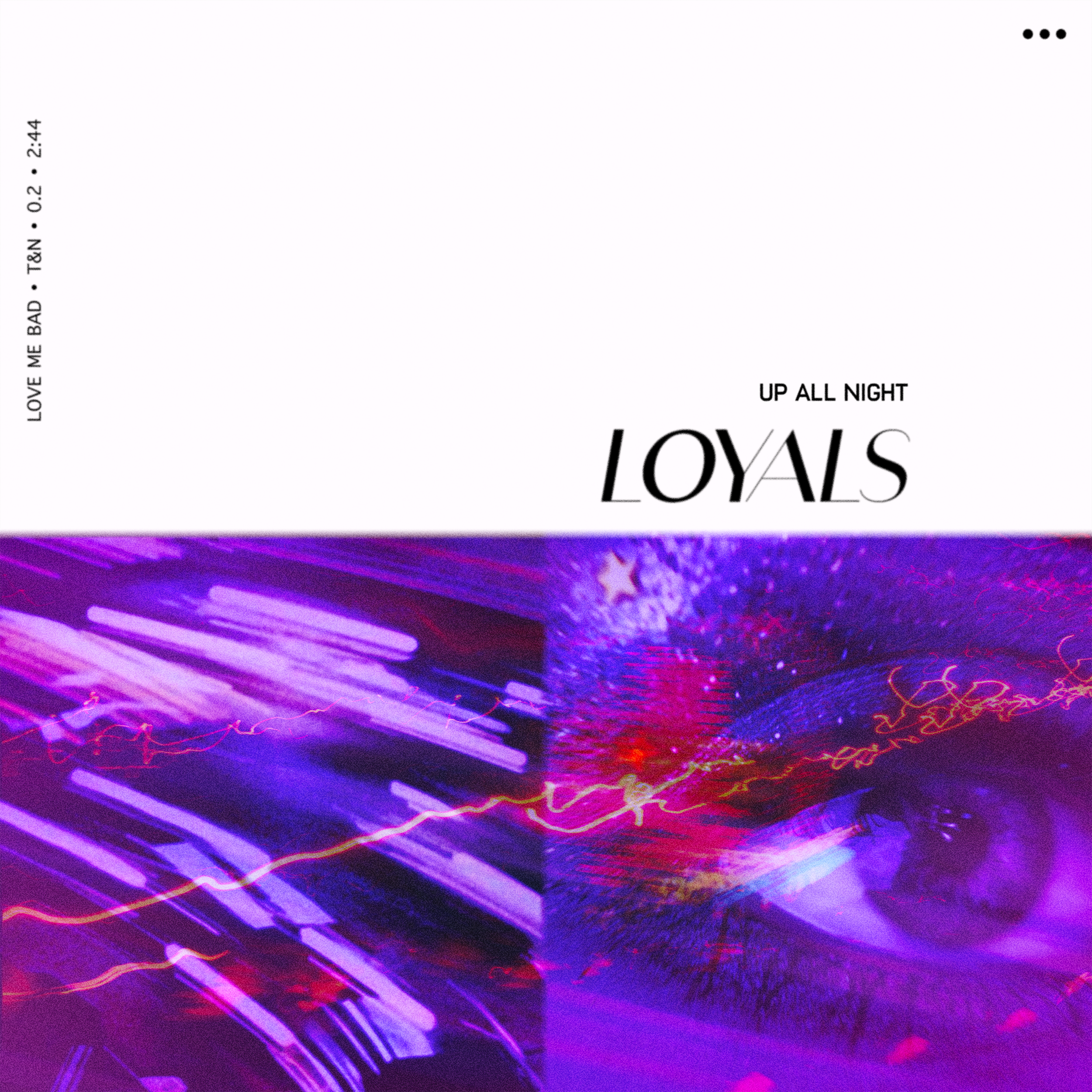
“UP ALL NIGHT”
When we started talking about “Up All Night” Andrew, Dane, and Ali, without any discussion, decided the color was ~purple~. We shot with spotlights and had the boys put on a high energy performance and then edited into a carousel effect - matching the feeling of driving down a neon city road with your new lover.


Photos by Brenton Giesey